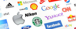
 Logos or the representative symbols are always there for all
kinds of businesses, brands, products and also for the institutions. It’s not
just a formality in fact it is a necessity that enables your brand to be
identified and recognized by the consumers by just visualizing it, even if they
don’t read the name of the product or the brand.
Logos or the representative symbols are always there for all
kinds of businesses, brands, products and also for the institutions. It’s not
just a formality in fact it is a necessity that enables your brand to be
identified and recognized by the consumers by just visualizing it, even if they
don’t read the name of the product or the brand.Talking about the characteristics, specialties and do’s and don’ts of a logo, they are endless. In this article we are going to tell you some of the most important characteristics of a logo and how logo designing should be done to meet the ever competitive and challenging world of marketing and branding.
Simplicity:-
Simple is beautiful, mostly stands true for a logo and it is
the best way to describe a brand or an organization. Complexity should be
avoided on all costs. By remaining simple you are conveying your message in
clearer way.
Dynamic:-
Consider Google for it.
 Flexibility and being dynamic are the two qualities of a
logo that define its superiority. Also, these two qualities must be there in a
logo so that it could be given a new and improved form for any medium whenever
needed.
Uniqueness:-
One of the main qualities of a logo according to the logo designing experts is its uniqueness. Why should it be unique? Because it has to be different from the competitors as the current times see a number of brands are competing to gain an edge in the same field.
Meaningful:-
A successful logo is always built around a powerful meaning
that the company wants to convey. There should be a thought process behind its
making, only then it can compete with the other logos and make it
self-meaningful.
Innovation:-
A logo must be innovative and there should be a proper
thought process behind it even if it is as simple as an alphabetic letter.
Creativity doesn’t always mean complex, entangled designs and lines in a
logo.
Color:-
Go through the logo of Microsoft once.
 Less or over usage of color should be considered carefully
while going for logo designing. Whatever the color scheme is, it should
be done sensibly. The usage of color must match the philosophy of the brand and
what’s more important is that it must be acceptable in the related industry.
Type
face:-
What about the logo of coca cola?
For a typeface to be unique it doesn’t always need to be
overly designed. A simple design can also be unique at the same time. there are
some typefaces going around in the market that are so unique and memorable that
they can’t even be copied due to their simple type face.
Unpredictability:-
A logo should be such that it breaks the stereotypes. Logo designing should be unpredictable and shouldn’t be overused as it
can lower its value.
Memorable:-
The swoosh of the Nike.
Last but not the least. The main purpose of the logo is to
be remembered. Even if the name of the product or brand isn’t there, customers
should be able to visualize the brand and relate to it.


Comments
Post a Comment